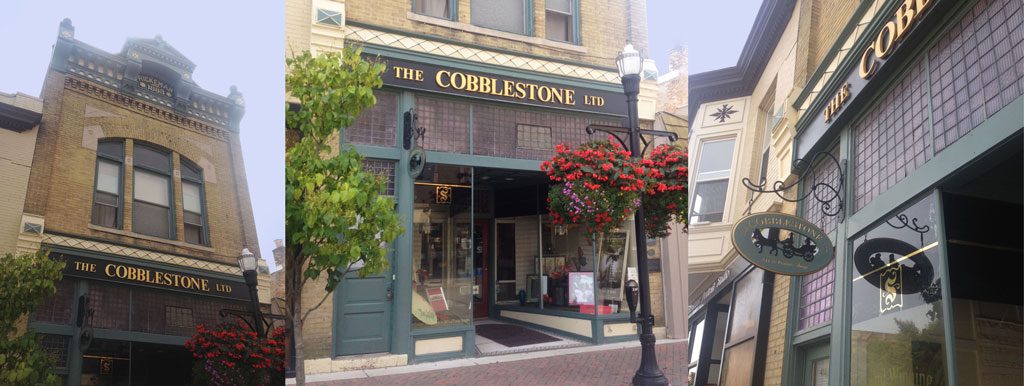
This downtown Racine storefront uses three different sign types (projecting, flush-mounted, and window signs). Their size and placement fit well with its architectural elements. It looks attractive and uncluttered. Many communities’ sign ordinances have size and quantity restrictions that wouldn’t allow this approach.
April 2023
By Joe Lawniczak, Wisconsin Main Street
Main Street business signage is vitally important not only for businesses but also for establishing the district’s character.
Signs portray an image, either good or bad, of the quantity and quality of a district’s businesses. As opposed to a building’s architectural features, signs are an element of the building’s exterior where the brand, color, and logo of a business can be expressed most appropriately—but regulations are necessary to create or maintain the image of a unified commercial district.
Signage in Main Street districts differs from signage in suburban shopping areas where traffic is moving at higher speeds and is more distant from the business. Most Main Street districts have a pedestrian scale, with slower traffic and more customers on foot. As a result, signs can be smaller. Since they are often attached to older and historic buildings, they should complement the architectural design of the facades.
Most communities have local ordinances regulating signage; many also have overlay districts such as downtown or historic districts, and each may have distinct requirements. Some communities rely solely on ordinances that are technical, dry, and hard to understand. Others, like De Pere’s new 2023 zoning ordinance, lay out the key parameters in an attractive, illustrated, easy-to-follow document.
Over the years, Wisconsin Main Street and other consultants have advised communities on appropriate sign design guidelines. With a goal to prevent signs that are too numerous or out of scale with their buildings, many of these recommendations have placed conservative restrictions on sizes and quantities. But Wisconsin Main Street’s thoughts on this have been evolving for several years, and we feel many of these past recommendations may have been too restrictive.
Let’s examine these issues by individual sign type and explore some simple language that communities interested in changing their local sign ordinances can use as a starting point.
As with all ordinances, communities must make sure they adhere to the U.S. Constitution. When it comes to signs, recent cases have found that municipalities can regulate signs as they affect public health, safety, morals, or general welfare. So, it is allowable to regulate size, quantity, placement, location, mounting, and making sure they don’t distract motorists or obstruct views. But—unless it’s a threat to public health, safety, morals, or general welfare—municipalities generally cannot regulate signs’ content.
It’s also a good idea to make sure any zoning regulations, such as sign ordinances, align with the municipality’s comprehensive plan and-or relevant studies on how signs affect traffic safety, blight elimination, and impact on property values. Find more information on recent court decisions.
Sign quantity restrictions
Probably the most limiting of the restrictions is how many signs each business is allowed to have on a building. Some ordinances only allow a business to have one sign. Others base the allowable number on a building’s lineal width or the overall area of a façade. And many simply have a set square-footage limit for each sign type.
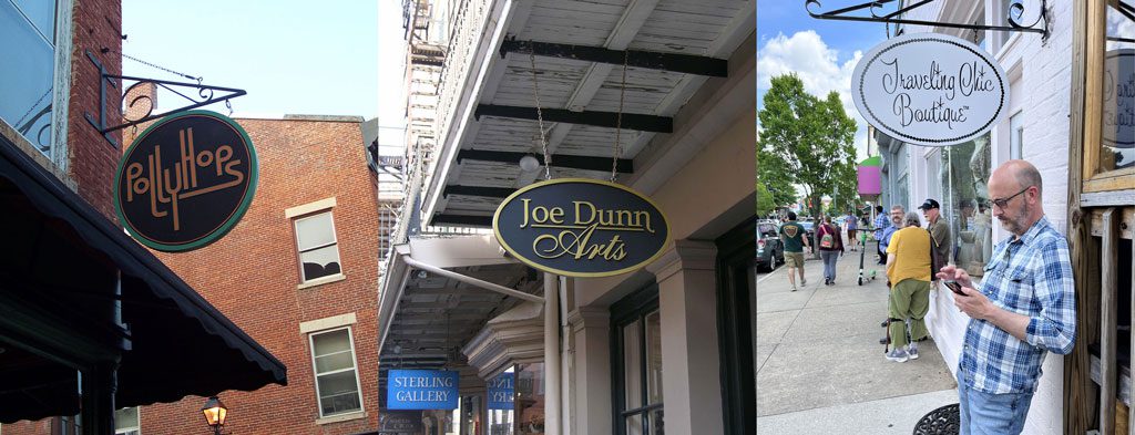
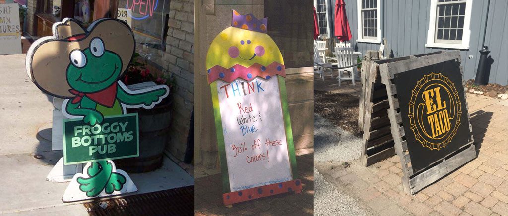
But there are countless examples nationally in which a business has appropriately incorporated a projecting (or blade) sign, a flush-mounted (wall) sign, a window sign, and a sandwich board (A-frame) sign all at one storefront. Whether it’s done appropriately depends on the size and placement of each sign in relation to the size of the openings and the location of architectural features, such as transom windows and storefront cornices.
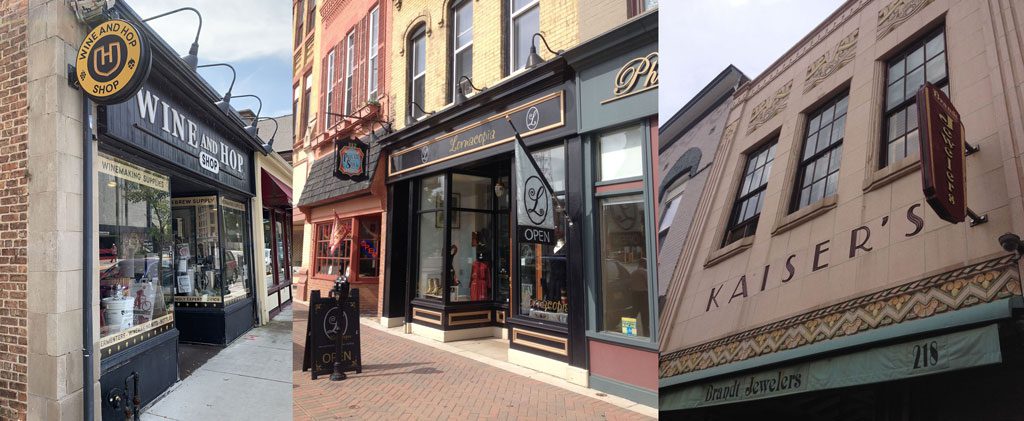
These facades employ three sign types each—projecting, wall-mounted, window, sandwich board, and even flag signs—without looking cluttered.
Northfield, Minnesota, addressed this in its sign ordinance for its historic overlay district and heritage preservation sites in section 6.10 (F) on pages 244-246. Instead of setting arbitrary size limits, the ordinance allows designers to take the building’s architectural features into account when determining size and quantity.
While that opens the door for a lot of interpretation, it also allows signage to be customized to fit each building. However, this approach might only work if those designing and reviewing the sign are able to determine appropriateness. Not everyone has a good design eye; still, the overall premise behind looking at each building on its own merit is a step in the right direction.
In contrast, the sign ordinance for downtown Whitewater allows each downtown business to have two permanent signs plus a sandwich-board sign. That’s a lot more lenient than many in the state and is a big step toward offering businesses flexibility.
It is possible to go a step further, allowing each business to have one primary and two secondary permanent signs, plus a sandwich board, without looking too cluttered. From there, communities could establish two sets of dimensional restrictions for each sign type, depending on whether its use is as a primary or secondary sign.
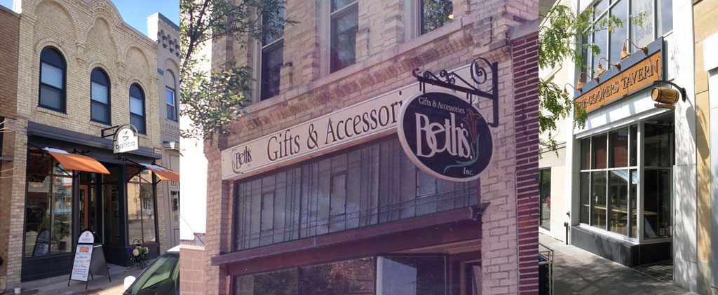
These facades effectively use two sign types each.
The following recommendations for each sign type will follow this primary/secondary approach and are focused solely on sign types typically found on Main Street that are either attached directly to the building or are placed outside of it.
Projecting signs
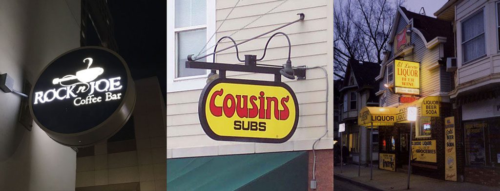
Perhaps the most common sign type on Main Street, projecting signs are visible from cars or pedestrians. Unlike signs in suburban shopping areas, projecting signs downtown can be smaller because the reader is much closer and moving at a slower pace. They should always reflect the character of the business and relate well with the building’s architecture. They can be built of many different materials, including metal, wood, and high-density foam. Some are banners or flags. Plastic or vinyl should be avoided, as they don’t blend well with most natural building elements such as brick, stone, and wood.
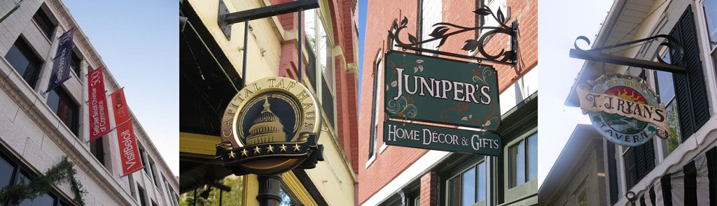
Different types of appropriate projecting signs, including banners, high-density foam, metal, and wood.
If a projecting sign is used as a primary sign with no corresponding flush-mounted sign, it is appropriate to allow up to 12 square feet in size. When paired with a flush-mounted sign, however, it should be reduced to as little as six square feet.
As a rule, projecting signs should be mounted so that the bottom is no less than seven or eight feet above the sidewalk. If the storefront also has an awning, a projecting sign will likely need to be raised above it for visibility. It is also appropriate to set a maximum height, such as 20 feet, or not above the sill line of the upper-floor windows. On buildings with a canopy, small hanging signs may be appropriate if the bottom of the sign is at least seven feet above the sidewalk.
The typical height for projecting signs is seven feet or higher above the sidewalk. But when there is an awning, it is usually placed above it, as in the photo on the left. When there is a canopy, it may be best to hang underneath, as shown in the center photo. The photo on the right shows a sign mounted too low, which can be an obstruction.
Communities may also set limits on how far a sign can project from the building. For a primary sign, allowing up to five feet out from the building face or no less than three feet from the edge of the curb typically works well. For a secondary sign, those dimensions could be reduced to four feet from the building face. Requiring the sign to be mounted, so that it doesn’t swing in the wind, is recommended. One potential caveat is when a proposed sign would project into a state highway right of way. The Wisconsin Department of Transportation may or may not have its own guidelines for such instances.
As for lighting, communities should push for projecting signs to be externally lit with small gooseneck lights shining down and directly onto the sign. These lights are best mounted to the top of the mounting bracket, with one combined conduit extending to the power source. Signs that are backlit or Internally lit should be discouraged for this sign type, but if a community does allow them, it should require that only the text and logo be illuminated, while the background remains opaque.
Lighting for projecting signs is best done externally with gooseneck lights, as in the center photo. Internally lit (backlit) signs should be discouraged on Main Street since they don’t relate well to the historic architecture, as shown in the photo on the right. If backlit signs are allowed, however, only the lettering and logo should be illuminated, as in the photo on the left.
Changeable or electronic message signs, sometimes referred to as reader boards, should not be allowed on projecting signs. These should be allowed only on sandwich boards, marquees, or landmark signs – or at buildings housing theaters, community centers, gas stations, or the like.
Flush-mounted signs
Flush-mounted signs are perhaps the second most common primary Main Street sign type. They are easily visible from the street or the opposite sidewalk and are especially effective on buildings fronting a central square or a large parking area. Since this type of sign is mounted directly to the building façade, it is vitally important that it relates well with the architectural elements and is placed in a logical location.

These flush-mounted signs each fit in a logical space of the façade without concealing architectural details.
Most often, these are elongated horizontal signs mounted directly above the storefront. Sometimes they are simply individual letters painted or applied directly to a storefront cornice; a wood, metal or high-density foam sign may also be installed into a recessed area of brick either above the storefront or near the top of the building.
As with projecting signs, it may be appropriate to set a limit of 20 feet or below the upper-floor window sills for the height of flush-mounted signs—but in cases where the building was designed to accommodate signage near the top of the building, a variance may be appropriate.
Regardless of the location and whether it’s a primary or secondary sign, a maximum of 25 square feet is usually adequate. Since a typical storefront is 15 to 18 feet wide, this would allow the sign to be the same width as the storefront and 16 to 18 inches high. Those dimensions should also work in most other areas of the building, such as a recessed brick area of the façade. Communities should allow some flexibility or dimensional tolerance if the building owner can prove that the sign’s most logical location is in a space that is slightly larger than 25 square feet.
As for lighting, the most common and highly recommended method is a series of gooseneck lights mounted above the sign, shining down and directly onto the sign face. As with projecting signs, internally lit (or backlit) signs should be discouraged, but if a community decides to allow them, it should require that only the text and logo be illuminated, while the background remains opaque.
Another appropriate lighting style for flush-mounted signs is halo lighting behind individual letters.
Lighting for flush-mounted signs is best done externally with gooseneck lights (either modern or traditional), but it may also be appropriate to use halo lighting behind individual letters as in the photo on the right.
Again, changeable or electronic message signs, or reader boards, should not be allowed.
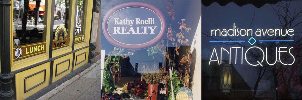
Window signs
Despite being considered secondary, window signs are possibly the most effective of any other type at catching the attention of passersby. If a person doesn’t see a projecting or flush-mounted sign on a particular building, they will likely see the window sign.
Window signs are typically either hand-painted or made up of vinyl lettering and logos applied directly to the storefront window. Since windows can appear dark during the daytime, using lighter colors is often recommended. They should be simple, uncluttered, and without too much text. They should occupy no more than 25-30% of the window, leaving room to see displays.

These window signs are simple but effective, taking up no more than 25-30% of the window area.
Some communities only allow one or two windows per building to have window signs—but, provided that at least 30% of the window area remains transparent, window signage on all street-facing windows can provide more exposure without creating visual clutter.
Another form of window signs are interior signs. These differ from temporary or utilitarian signs such as “open” signs, store hours, and posters. They incorporate the business logo just as any other primary or secondary sign would, but they are hung just inside the window instead of being painted or applied to the glass. They are typically neon signs or small versions of projecting signs. Similar to window signs, they should take up no more than 25-30% of the window area. In the case of neon, they should be simple in design, should use no more than two or three colors, and should never be flashing or blinking.
Colored bands at the top or bottom, interior-hung signs, or even simple non-flashing neon signs can be effective and appropriate in storefront windows.
Another form of window signs are horizontal, colored bands either at the top or the bottom of the window. Within the colored bands is simple lettering in a contrasting color indicating the business’s products or services. Communities should allow these to be used in addition to other window sign types, as long as they don’t take up more than 25-30% of the window area in combination with other window signage.
Sandwich-board signs
Sandwich-board (or A-frame) signs have increased in popularity in the past couple decades—and for good reason. They are highly visible to passersby and, like sidewalk seating and outdoor merchandising, they can make an otherwise empty street look vibrant, inviting, and open.
Since they are so effective, sandwich boards are a recommended sign for all ground-floor storefront businesses, regardless of what other signs they have or are proposing, as long as there is room on the sidewalk and the sign meets design and maintenance guidelines.
Sandwich-board signs are not only effective; they can also make an otherwise empty sidewalk seem open, inviting, and vibrant. They should be designed to reflect a business’s character.
Sandwich boards should reflect the business’s character and should be no larger than two feet wide and four feet high. Areas for changeable text, such as slate, blackboard, or whiteboard, should take up no more than 60% of the sign, with the other 40% incorporating permanent lettering or a logo.
These signs should be portable and should be outside no sooner than 30 minutes before opening and no later than 30 minutes after closing. They should be custom-made, or at least customizable, when possible (instead of off-the-shelf, generic signs).
These signs should be solidly constructed, with removable ballast at the base, such as a sandbag, to provide stability. They should only be allowed where a minimum of clearance of four to five feet can be maintained for pedestrian traffic and where they do not obstruct building exits.
Multi-tenant and multi-storefront buildings
In these examples, the intent is that the size and quantity restrictions are on a per-tenant, business, or storefront basis. Some communities use language such as “per building” or “per street frontage,” which could be interpreted to mean those limits pertain to an entire building or an entire street-facing side of a building, even if there are multiple tenants or storefronts. If an ordinance states that only one sign is allowed per building or street frontage, it could insinuate that only one of the businesses within a building is allowed to have a sign. It would seem less confusing to use a per-tenant, business, or storefront approach.
Multi-tenant buildings are often populated with office or service businesses, which don’t need the signage to catch the attention of passersby as much as stores or restaurants do. Combining signage for all these tenants into one uniform sign is often best. In this case, a maximum size should be 10 to 12 square feet.
Multiple-tenant signs like these can be the same size as individual business signs, since these business types don’t typically rely on walk-in traffic.
Sign colors
There has been a surprising amount of discussion lately from communities wanting to regulate sign colors. Signs, however, are the one area of a building where a business’s brand, image, character, and freedom of expression should be allowed.
Most businesses have set brand specifications relating to color and font. Local ordinances should not impede upon that. It is one thing to encourage or even require that certain color palettes be used for the building itself, but this guidance need not apply to individual businesses’ signage and brand colors.
Depending on a building’s size or configuration constraints, it may be most appropriate during the design review process to steer the owner away from using the full logo or brand colors on the signage. Instead, they could use a more generic sign with simple letters and a color that better suits the building. For example, this may be appropriate when a business’s logo is oriented vertically but an elongated horizontal sign is the most logical for the building. Similarly, in the case of multi-tenant signs, where there isn’t enough space for everyone to use their own unique logos, a more generic font and color scheme without logos should be considered.
As a general rule, using a dark background with light lettering and logo provides the best legibility for signage. If a business’s logo does not fit those parameters, perhaps a more generic lettering-only sign would be best.
A municipality may not be able to regulate these examples, but a design review committee could offer them as suggestions to help applicants create more effective signage.
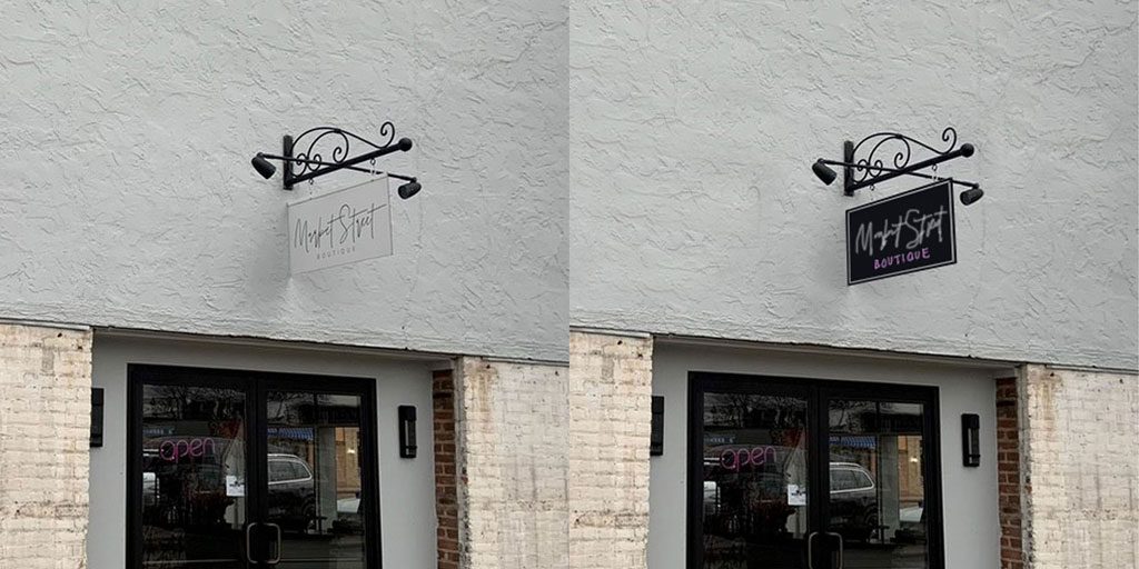
These two versions of the same sign show how a light logo and lettering on a dark background typically provides the most effective contrast to attract attention.
Changing to meet business needs
Changing times and consumer preferences call for us to adapt. When it comes to something as important to business vitality as signage, a willingness to evolve is critical. The intent of sign ordinances is to balance business marketing needs with the desire to present a cohesive, visually appealing face to the world. Done appropriately, ordinances can take each building’s unique assets and business personality into consideration while creating a consistent, coherent look and feel to create an inviting and attractive Main Street district.
