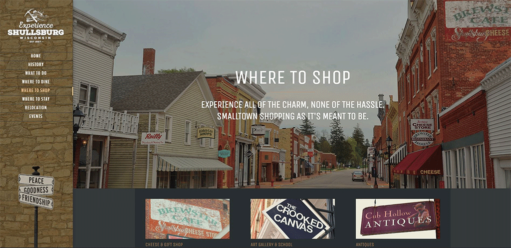
A clean interface, meaningful visuals and easy to understand navigation makes the Experience Shullsburg site an easy choice for visitors.
Your organization’s website is like a front door. Make it inviting and easy to use, and people will come inside and look around. Neglect it and, chances are, they’ll cruise along to the next place.
Most people will check out your website before attending an event or visiting your community—making a strong online presence essential. Having an attractive, functional site is crucial to building credibility and brand awareness, appealing to potential new visitors and encouraging repeat visits and business. To stand out, you’ll need to follow design basics, ensure your branding is consistent across all channels and learn how to best market your website to optimize traffic and showcase your community.
Spiff up your site, with design in mind
Your website must be user-friendly and easily navigable. It should feature well-chosen fonts, colors and other design elements. A well-designed website helps build trust and guides visitors to what they are looking for and creating a great user experience.
Clear out the clutter

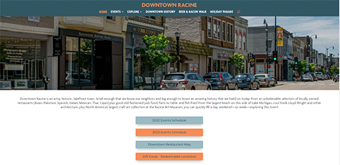
Downtown Racine’s home page presents easy access to their events calendar for both desktop and mobile devices.
Your site’s homepage should communicate your core message instantly. A visitor rarely reads every word on a website, but rather, quickly scans the page to pick up key words, sentences and images.
When designing your homepage, focus on emotions rather than word count. The less visitors need to read, click on or remember, the better they will be able to process and evaluate your content. Present text in bite-sized, legible paragraphs, and make sure to include space between elements to give your design a spacious, well-balanced feel.
Those reading tendencies also make it vital to keep your most important messages “above the fold” (that is, on the part of your homepage a website visitor sees before they scroll down). That way, readers can see what your organization or community is about as soon as possible.
Because of the way people read webpages, visuals—such as beautiful photographs, vector art or icons—are key to reinforcing your message and allowing potential visitors to see the best side of what you’re promoting.
Your homepage should also include a call to action that tells readers how they can learn more or engage with your organization. Examples include prompts to sign up to become a volunteer, donate to the organization, visit your community or sponsor an event.
Be a website sherpa
Hierarchy is an important design principle that, when implemented correctly, will help to guide readers through your site, drawing their attention to page elements methodically in order of priority, starting with the most significant piece.
The main components that drive visual hierarchy are size, weight and element placement. With size and weight, highlight your top assets, such as an organization’s name and logo, by making them more visible. Readers tend to gravitate to large and bold titles first, and then move to smaller text. Similarly, elements placed in the center of the screen or in the header tend to attract the eye first.
Once you establish a clear hierarchy, readers can’t help but unconsciously follow the breadcrumbs you have left for them. Then you can apply color, contrast and spacing for further emphasis, remaining mindful of what draws the most attention and ensuring that every element is intentional.
Keep it easy to read
Nobody goes to a website to wade through a thicket of words. Help site visitors by making your content readable.
Readability measures how easy it is for people to recognize words, sentences and phrases. When a site’s readability is high, users can effortlessly scan the site and take in information. Try tools like Juicy Studios or Gunning Fog to analyze website readability.
Here are some key principles for website readability:
Contrast is key. Contrast between text and color and background color is important for readability. While your website color scheme is likely to be representative of your brand colors, make sure there is sufficient contrast between your elements. Contrast is also important for website accessibility. According to the Americans with Disabilities Act, if an organization’s website is for public use, the organization must make their websites readily accessible and usable by individuals with disabilities.
Size matters. Most people will struggle to see smaller fonts. One rule of thumb is to keep body text in at least a 16-point font. While that’s a good place to start, keep in mind that the minimum readable size depends on the fonts you choose for your website.
Choose fonts wisely. It can be overwhelming to choose from the avalanche of available fonts. Fonts with serif (those that have little projecting lines on the ends of the letters, like Times New Roman) are typically the best choice for short online texts or headings, while sans serif fonts (those without the projecting lines, like Arial) are typically the best choice for lengthy online texts. You can also create interesting font pairings by mixing different fonts. If you are using a display font that is more decorative, such as a script font that looks handwritten, be sure not to overuse it and overwhelm your visitors.
Less is more. The general rule is to avoid using more than three different typefaces throughout a single website. Some projects may call for more elaborate font combinations, but too many varied typefaces usually appear cluttered, distracting from your brand identity.
Use text themes. To establish a clear hierarchy, make sure your written content varies in size and weight—from large titles to smaller subheadings and then to even smaller paragraph or body text.
Smooth navigation delivers your message
One of your goals should be to help visitors easily find the information they need. Sites with solid navigation help search engines index your content and greatly improve the user experience. Here are some ways to make your site easy to navigate.
Link your logo to the homepage. A logo should be present in every header and footer that takes a user directly back to the homepage. This is a common practice that visitors expect, and it saves them some precious clicks.
Mind your menu. Whether you opt for a classic horizontal list or hamburger-style menu layout, your website menu should be prominent and easy to find. Be sure it is organized according to the importance of each section. Your existing website and social media traffic can give you a sense of what your audience is looking for from your web presence.
Offer vertical navigation. If your site is the long-scrolling variety, such as a one-page website, use an anchor menu. With one click, viewers will be able to quickly jump to any section of the site. Another option to consider is the “Back to Top” button, which leads visitors to the top to the page from wherever they are on the site.
Don’t forget the footer. When a user reaches the bottom of your site, they are expecting to see important links there. Include your contact information, social media icons, a shortened version of your menu and any other relevant links visitors may need.
Stay mobile-friendly
Your site visitors should be able to enjoy your website at its very best, no matter what device or browser they are using. Review your site’s mobile and desktop versions in various browsers, putting yourself in the shoes of the user and testing out every page, user action and button.
Your mobile website should be cleaner and less cluttered than the desktop version; consider minimizing page elements and scaling down assets such as the menu.
Branding is the name of the game

Consistent branding from the design of your website to your social media accounts helps build credibility.
Branding consistency provides your organization with an identity that pops and establishes credibility.
When your organization follows a consistent brand inside and out, from the design of your website to the tone of your blog posts, that voice will help your brand stand out and distinguish your organization. Its tone and style will help visitors understand who you are and what you stand for. A strong brand makes your organization more recognizable and trustworthy.
To help deliver brand consistency across all marketing platforms, including your website, social media, and print and email marketing, develop a brand style guide. This encompasses more than just typography, color palettes and a logo. Your style guide helps convey tone, personality and values across your organization. Here are five elements to include in your brand identity:
Mission statement and values. Your mission and value statements provide the foundation of your brand identity. Your mission explains why your organization exists and why the user should care. Core values serve as the guiding principles for how you conduct yourself as an organization. These values will help guide decisions on the decisions you make, such as with whom you partner.
Both of these brand elements should be proudly presented on your website, fundraising platform, annual reports, brochures and other deliverables. Make it easy for visitors and supporters to understand who you are and what you’re trying to accomplish.
For example:
- Website: List your mission statement on your homepage and “about” page, so visitors know what impact your organization has on the community.
- Fundraising platform: Feature your mission statement and values within your brand story or any videos you produce, so supporters understand how you’re trying to better the community.
Target audience. To develop a successful marketing strategy, understand to whom you are speaking. Typically, you will have more than one target audience, each with different connections with your organization. For example, three distinct audiences might be volunteers/staff members, tourists and community members.
To reach these distinct audiences, leverage these tools:
- Segmentation: Build segments through your email marketing platform to deliver distinct messages to each audience, while staying on brand.
- Personalization: You can deliver personalized messages at scale by using merge fields to tailor each deliverable to the individual.
Tone and voice. By dialing into your brand’s distinct tone and voice, you allow your organization’s personality to shine through. This is like developing a distinct “language” for your organization, so you know whether to write in a quirky, fun way or a more formal, businesslike voice.
You can deliver your own brand voice in a number of ways, including:
- Your fundraising feed: If your organization wants to ignite excitement and celebration, add emojis, GIFs and drawings to your supporter feed.
- Text updates: If your new brand is more casual in its communication, you might find that certain channels—like texting—work better than others.
Color palette and typography. To deliver brand cohesion across all channels, you’ll need to include fonts and a color palette in your style guide. Colors and typography are included in all aspects of graphic design, including infographics, social media posts, headers for your newsletter templates and your website. If you want past and future visitors to recognize your brand on all platforms, you must arrive at a consistent visual identity.
Logo and images. Finally, every rebrand should include clear instructions on how to use your organization’s logo and which types of images are best suited for your audience. Logo size and style should never be modified, but the logo will typically come in multiple formats, such as an icon for your site title, a circle or compressed version for social and a horizontal logo for your website.
Be thoughtful to ensure that images, whether stock or proprietary, reflect the entirety of the community. You can include imagery across a few marketing media, such as:
- Video: Embed a brand video to include on your website, or send personalized videos to supporters.
- Social media sharing: Create custom graphics and share them through one-click social sharing.
Your front door to marketing
Your website is your best marketing tool. A website with great visuals and valuable content can set an organization apart from its competitors. Website marketing means promoting a website in order to bring in more users. These visitors should be people who are likely to interact with the organization or visit the community. More visitors mean more opportunities to showcase local assets.
Here are some tips for successful website marketing:
Solidify your SEO. Search engine optimization (SEO) is one of the most effective ways to promote a website. It helps improve a site’s ranking on Google and other search engines. Unlike paid search ads, SEO is free. The competition is open to everyone and is based on the quality of your content, the fluidity of the navigation you offer and the number of links you receive from external sources.
Strong SEO is achieved by placing certain keywords and phrases throughout your website, adding alt text—which is read aloud by screen readers used by visually impaired users—to your images and optimizing your headings so your website can be found on search engines. Since SEO requires time and effort, it can be helpful to use automated SEO tools like INK or MarketMuse.
Submit your site to online directories. Optimize SEO, but also submit your site to online directories that make it easy for people to find your URL and navigate to your site. If you have a brick-and-mortar location, submitting to local directories is even smarter.
Free services like Google Business Profile (formerly Google My Business) allow you to claim your organization so when someone searches for you, a complete set of details—including your website, hours, contact details and a map of your location—appears on the results page. Other directories to consider include TripAdvisor, Yellow Pages and other review sites.
Use email marketing. Email marketing can be a reliable means to drive traffic to your site. When done well, the investment made in email marketing can be returned to your organization many times over with increased revenue.
Newsletters are a particularly effective form of email marketing, since they are a direct form of communication between you and your audience. They also help you gain subscribers and can help drive traffic to your website. To create an engaging newsletter, keep your content interesting and direct, and use prominent calls to action that encourage readers to click.

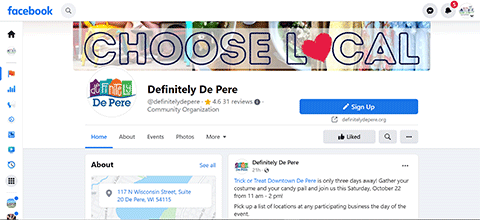
Leverage traffic from your social media accounts to cross-promote your events and updates.
Harness social media’s power. Social media is an effective way to promote a website, as it helps businesses reach a diverse audience and build brand awareness. Whether it is on Facebook, Twitter or Instagram, social media marketing is important for engaging followers. Compelling social media posts help leverage website traffic.
Don’t forget to cross-promote on all your social media platforms, so all your networks benefit from as much of your content as possible. For example, you can share your Instagram video to Twitter or your latest blog post on your Facebook page. You can also add a social bar to your website so visitors can easily find and share your content.
Using other people’s expertise and voice on your social media channels is also important. People in your community have different perspectives and followings on their social media platforms, and by collaborating with them, you can increase exposure and interest. Encourage businesses, sponsors and other partners to do a social-media takeover to promote themselves, or you can cross-promote and highlight your supporters and partnerships.
Reach out with outreach marketing. Outreach marketing involves connecting with others in your organizational niche, such as bloggers, influencers, industry partners and other professionals, to promote your website. Ideally, you can build a lasting relationship with these professionals that will help you increase your site’s exposure.
Start with identifying your marketing goals, then find people who can help you achieve those objectives. Reach out with a pitch and follow up when necessary. Try sending your pitch via email or social media platforms such as LinkedIn and Twitter. Make sure to tag industry partners on social media posts when relevant.
Focus on quality. When learning how to promote your website, your focus should be on publishing expert, informative content. This is true regardless of which promotional strategies you choose: posting on social media, writing blog articles or partnering with influencers. Prioritize quality over quantity. This helps build trust among site visitors and drives them through the marketing funnel. This is one of the best things you can do for your organization in the long run.
